
The interface has become more modern and the fonts are more readable. Following Gmail , Drive , Docs and a number of other services, Google has updated the Calendar design based on Material You principles. One of the main innovations is the dark theme.
The main calendar is now placed in a container with rounded edges, and everything else, including the top and sidebars, has a light blue background. This matches the design of other Google Workspace services.
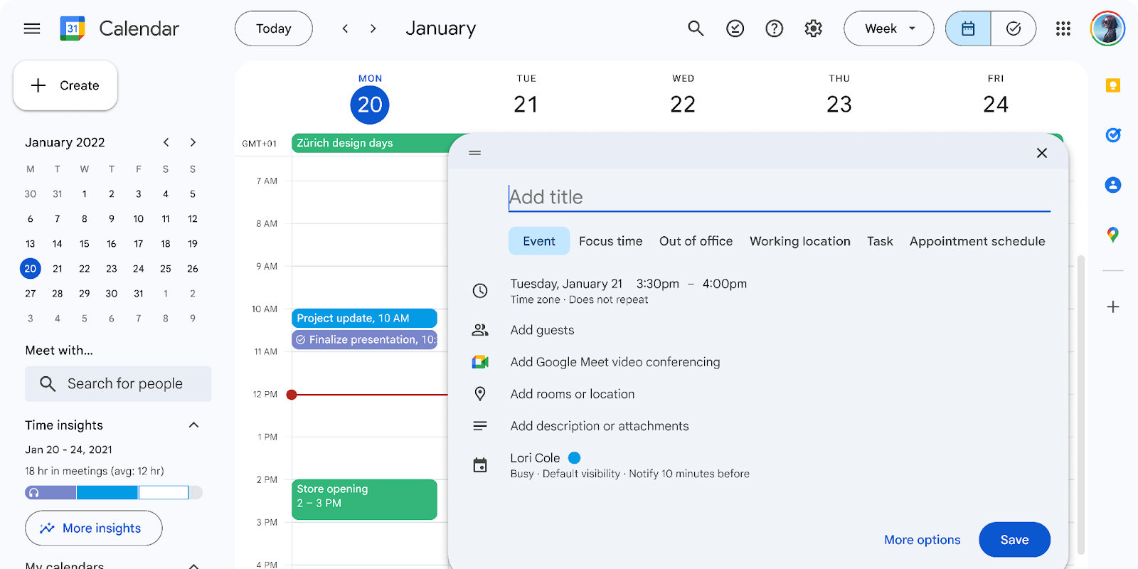
The controls have also become more modern and accessible. The fonts have also changed – they have become more readable. In addition, Google has updated the icons, making them more legible.
But the biggest innovation is the dark theme. You can enable it in the settings: just click on the gear and select the “Appearance” tab. It is possible to apply the color theme of the device.
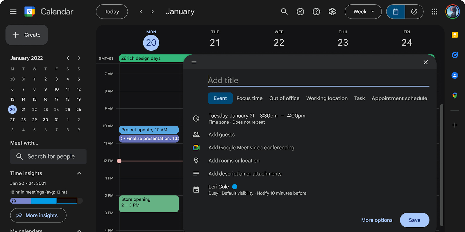
Google warned that the visual changes could impact the functionality of extensions that interact with Calendar . The update will be available to all users in the next few weeks.
Leave a Comment